Hannah Overman Koch

Sunday, February 19, 2012

Magpies and Poetry

I recently joined a mail art swap my friend Jill over at Recycled Daze organized!  I think the best part of joining a mail art swap is when you are going to your mailbox and you find such an eye feast of beautifully made postcards!!!  Like these from Jill.....


2 postcards from Jill Eudaly;
One is for sorrow
Two is for Joy


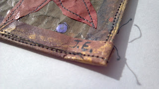
Her initials placed nicely on the trim.

These cards have a nice feel.  The colors are rustic; olive greens, yellow ochre, sienna brown, copper with hints of a metallic lavender.  Beautiful!  The sewn line is surprisingly more subtle on the bird versus the sewn line on the trim.  I also like how the paper took the color more in the wrinkles .  It has a feel of being from long ago, while it stays contemporary with the slightest glossy sheen!


Very Nice job Jill!!!


Texture and color!!


Magpies

Thank you Jill!  Just love them!


I also received another beautiful card from a mail art swap recipient, Jane Smith!!!


A fantastic collage by Jane Smith!


She has placed many different elements together here and they work so nicely together!  One of my favorite elements is how she placed the small music note piece atop the word poet on the red.  I just love how it looks like there is a hole in the red paper with the music sheet showing through when in actually it is not.  A trick for the eyes!  She has such attention to detail in her work.  And her hand writing is also very whimsical and free!  


Excellent Jane!!!


Enjoying the blotches of red along the border.


Love the stamp!


A detailed photo of the front of the envelope, she decorated as well!


Here is the back of the envelope with her lovely handwriting!


Thanks Jane!!!  Love your style!


Such an awesome mail art swap to be a part of!!  Thank you Jill and Jane!  It was great to see your work in my mailboxes!

If you wanted to see my mail art, you can click here.


looking for magpies and reading beautiful poetry on this artist holiday,
hannah


Wednesday, February 15, 2012

Mail Art


My friend, Jill, over at Recycled Daze  put together another mail art opportunity for her followers.  These are so much fun, because you make something and send it off, all the while someone else is making something for you!  What theme to create is always my question.  She scheduled it around Valentine's Day, so the love theme was a real possibility.  But me having to be different finally decided to go in another direction, a direction I find very tangible now and always...  positive inspirations!

By choosing to join the mail art swap, I had to create 2 pieces of mail art.  I chose the 4x6 postcard size as my blank canvas...


Inspiration to Grow On and  A Visible Lift


Front View of 2 cards

Materials used: sturdy watercolor paper, magazine cut-outs, acrylic paint, metallic pens, black pen, tracing paper, thread


Back View of 2 cards

I wanted each person to read both inspirational phrases, so I wrote each phrase on the back of the cards.  This is the side I placed a quick note on the left and their names and addresses on the right.


I used cut outs from an art catalog, among various other cut outs on these 2 cards.  I always love how they fan the paint brushes to show the whole collection.  
A little more subtle in these cards, but equally loved is the blocks of color catalogs will display on the page to show you the variety they offer.  Some have interesting names!


I have always enjoyed creating collages and this was a perfect opportunity for me to dive back in.  I had some special thank you cards I wanted to write to a few friends, so I took this opportunity to create those as well!


Detail view of 4 postcards


Each postcard has an inspirational phrase on the front.


I once again used magazine cut-outs of things I found interesting.  Looking for various textures and patterns to interact.  It is so cool to flip through magazines and cut out words and phrases that, most of the time, have nothing to do with creativity but I interject it as such!!


Make Your Change Show
Make Every Day Special
Make Your Mark
Make Your Own Experience


Each phrase is something I think about and try my hardest to live each day.  


Back view of each card with my signature and all inspirational phrases for each person to read!


finding textures, patterns and words of inspiration to share on this artist holiday-
hannah


Wednesday, February 1, 2012

A Wedding Gift

What started out as a special wedding gift for my own marriage soon blossomed into a cherished wedding gift by many friends and now family.  Jeff and I were married 02-02-02, 10 years ago tomorrow!  Below is my first attempt at this project.


Koch est. 2002
Materials used:  tags, beads, buttons, feathers, rock, gumball, nails, twigs, gray linen and adhesive.


Over the years these shadow box frames of memories have become more colorful, fun and elaborate.  My little sister, Leah, was getting married and I knew just what to do for her frame! 


 Leah was married to Jonathan 11-11-11!  She was a beautiful bride!  


my baby sister, Leah Overman Craddock


Below is the unframed finished piece I created for Leah and Jonathan.  Each little something is specifically pertaining to them.  Cowboy and cowgirl boots (purchased at craft store scrapbooking section), duck tape letter d's, ribbons from bridal showers, boutonniere from the wedding (silk), wedding and shower invitations (some cut up), and chunky costume jewelry (Leah's favorite!).


The Craddocks est. 2011

Can you see it?


this photo shows "the Cradd"

The d's were the hardest letters to figure out.  I finally came up with the idea of applying small pieces of black duck tape together and then cutting out lower case d's.  (this pertains to Jonathan, who is an avid duck hunter)!


this photo shows "ddock's est." . 

"est." is purchased plastic lettering.


I subtly added shower invitations as a backdrop for a few letters (the r and the c).


2011 tags were created using acrylic paint and colored pencils.  These are actual tags from a big box paper store.  I used black ribbon as an accent on the tags.  (Leah's colors were black and white, with persimmon orange)!


The finished product!
Their new address is included at the bottom of the frame.  Therefore, this photo had to be cutoff.


I am thrilled to say she and Jonathan loved it!  


sharing my creativity to remind us to cherish our families on this artist holiday,
hannah